Belonging Network: Support for Families and Youth
- Social Justice
- Health
The Belonging Network, formerly the Adoptive Families Association of BC, works tirelessly to provide support, learning and connection for adoptive and permanency families and youth in and from government care. The Canadian non-profit offers a range of services, including online resources, workshops and education programs for this community, with distinct support and learning tools for youth and young adults transitioning to adulthood. They work towards the shared goal of providing a space where everyone can belong.
This case study reflects on our naming and branding work with the Belonging Network. To learn about how we worked with their team to create their website, read the Belonging Network: Creating a Community Online case study here.
the challenge
Everyone deserves to belong
Guided by their strategic plan and expanded scope of work in the permanency community, the Adoptive Families Association of BC (AFABC) engaged us to rename and rebrand their organization. Recognizing a path forward that included kinship care, Indigenous customary care, guardianship, and adoption, it was clear that the organization's name needed to change to comprehensively represent its purpose and services.
While their primary audiences focused on permanency families and youth, there were other diverse groups within the community to consider. The new name and brand needed to be inclusive, lasting and reflective of their wide-ranging support options for families and youth at every stage of their journeys.
Client
- Belonging Network
Sector
- Social Justice
- Health
Service
- Branding
- Strategy

the solution
Finding the right words
We began with a discovery phase, during which we conducted group and 1:1 interviews with key members of their audiences and Indigenous partners. We then collaborated with their executive group and Board to establish a name reflecting the redefined organization's core purpose.
Through this process, we gained a strong understanding of the organization’s purpose and mission - why they do what they do and how they do it. Building from their deep belief that everyone deserves to belong - a message that resonated throughout the interviews - we entered the initial exploratory phase of the re-naming engagement. We established a set of words we use, words we don’t use and sensitive words as guideposts that would ensure our recommended direction maintained alignment with the organization’s core values.
A welcoming brand identity
Once the Belonging Network was approved as the new name, we immersed ourselves in the strategic work that laid the foundation for the new brand and visual identity.
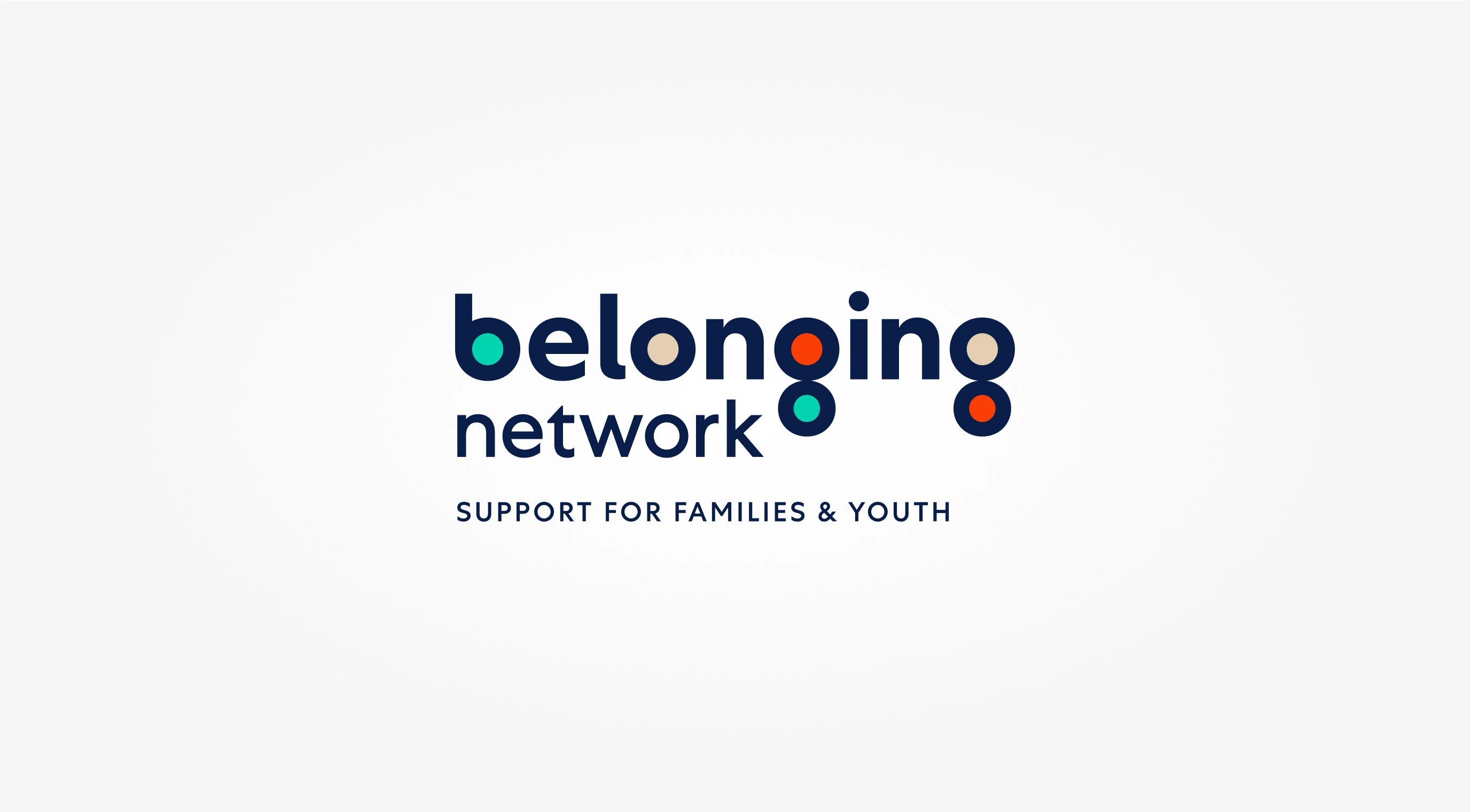
The logo design came first, with a wordmark that answers the design brief of being accessible, approachable, and modern. Emphasis was placed on the word “belonging” to drive home their core value. The word “network” is strategically placed below to accentuate the word “belong” within “belonging,” further creating a sense of unity and mutual connection.
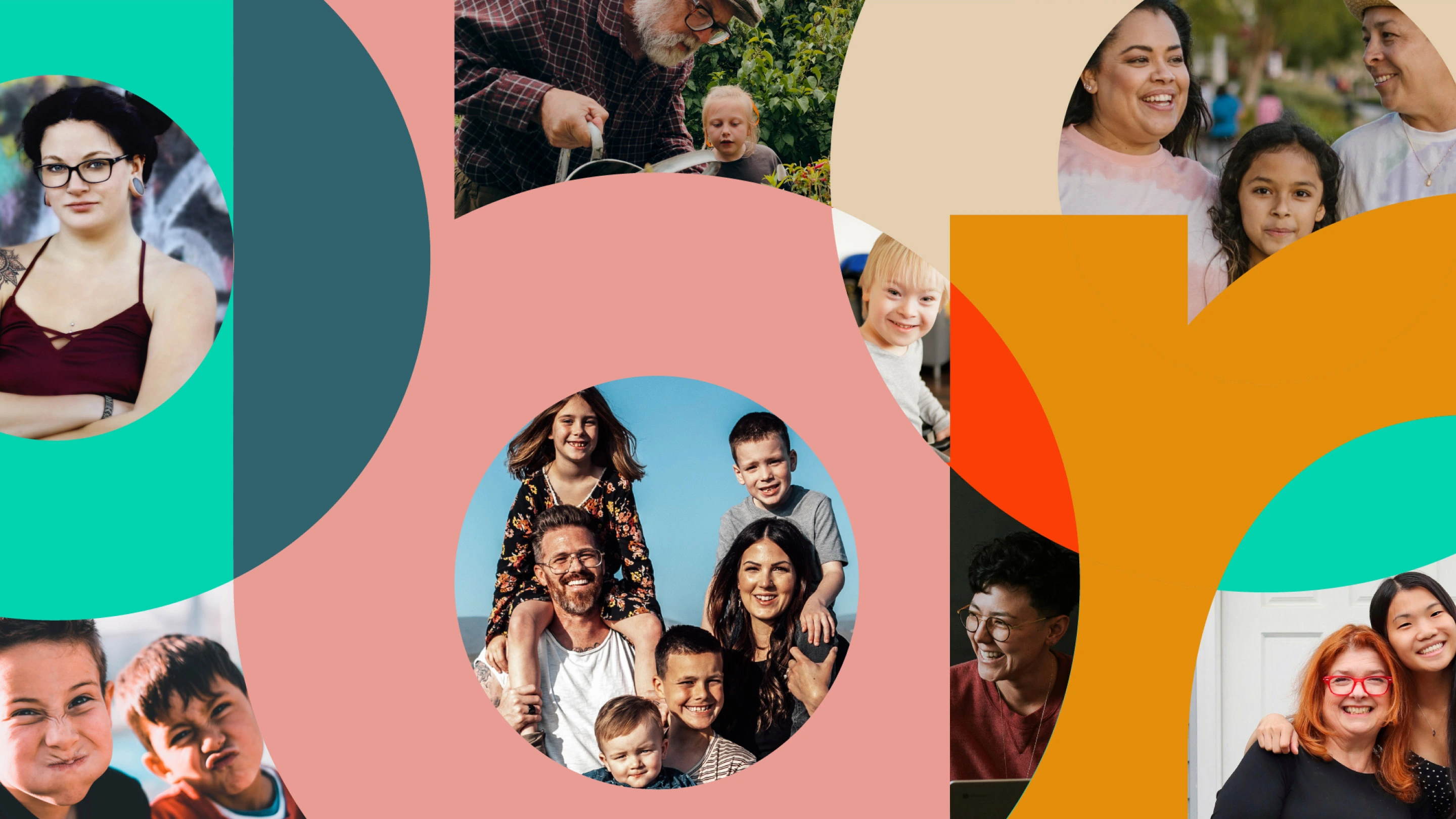
We used custom lettering, designed with smooth, rounded forms in a heavyweight and set in lowercase, to establish a feeling of openness and approachability. Multiple circles within the logo are metaphors for the relationship between individuals and the community. The different-coloured fills within the letterforms represent diversity and people of all types, encased in the word “belonging,” which connects them all together.
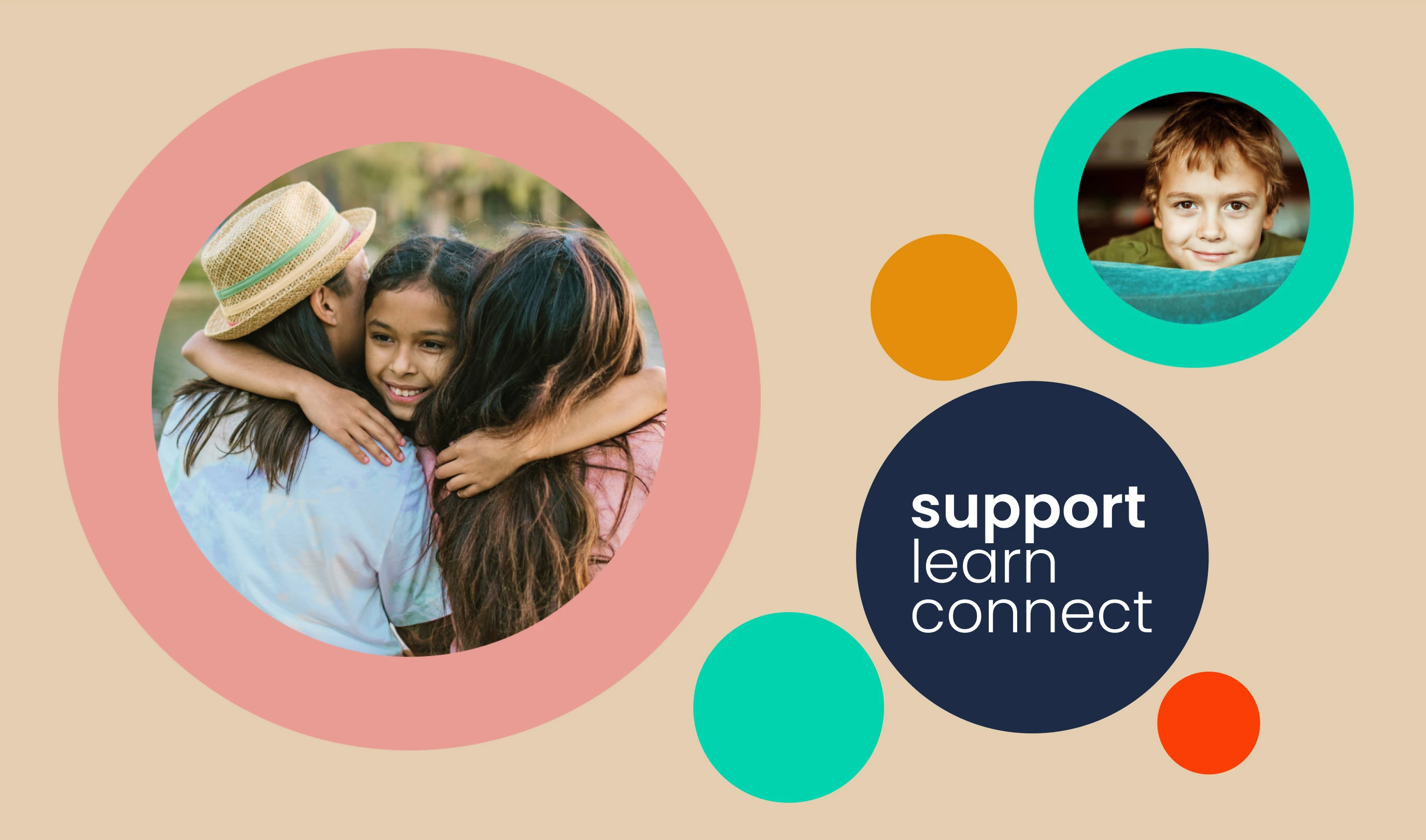
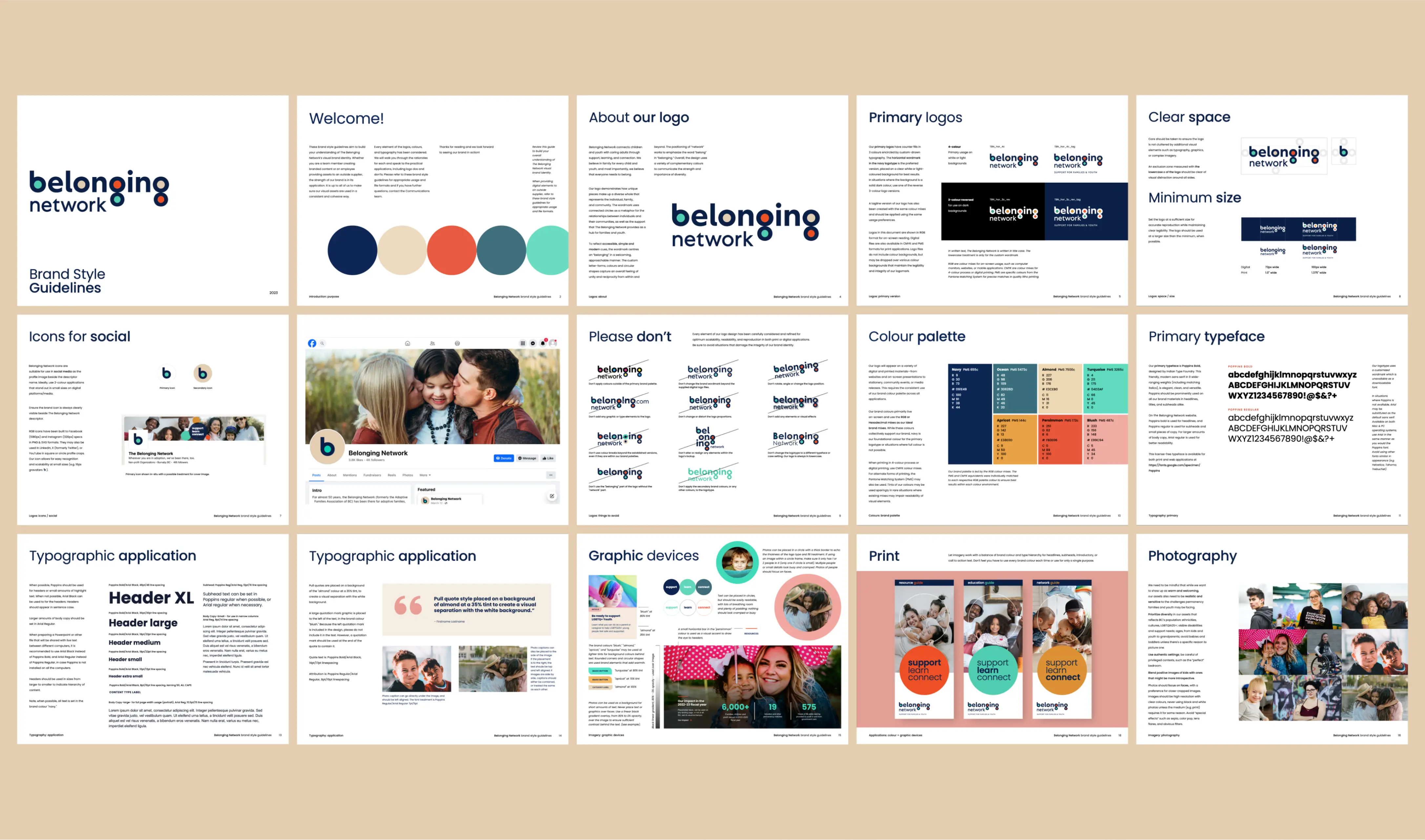
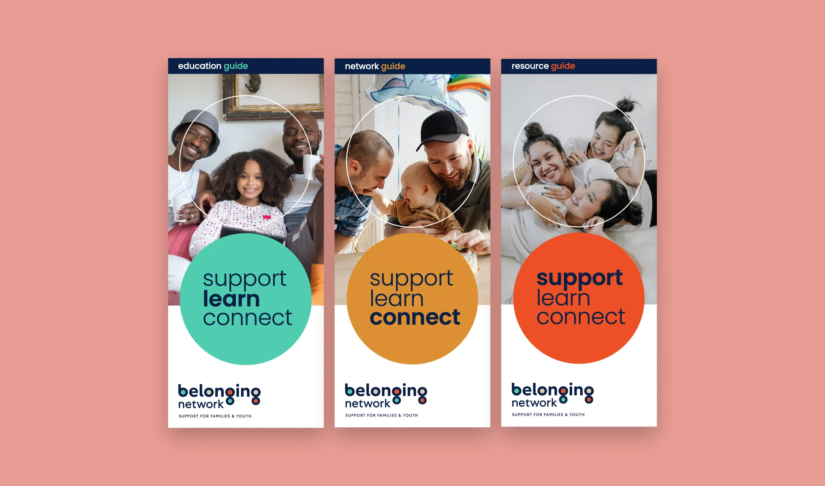
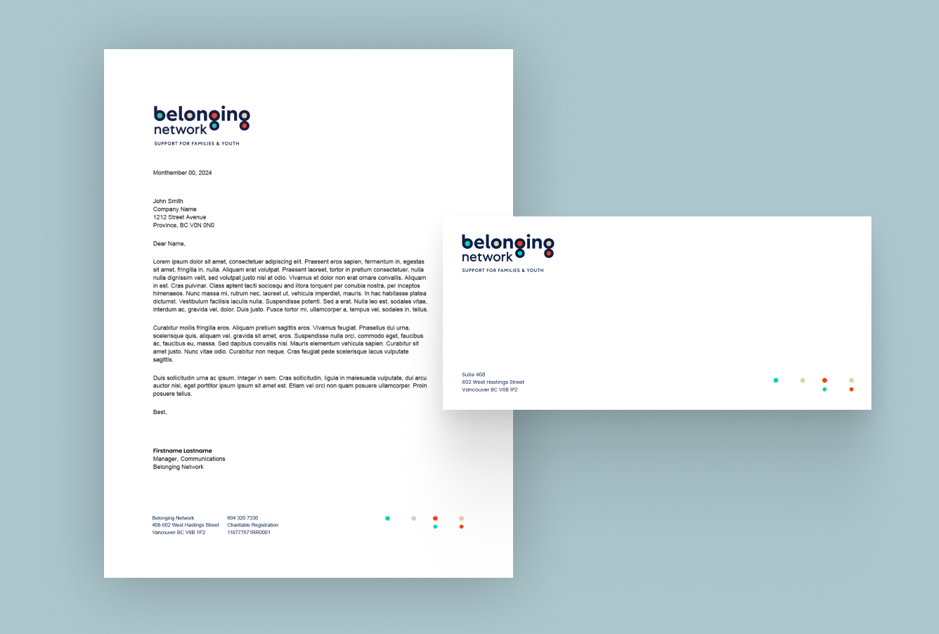
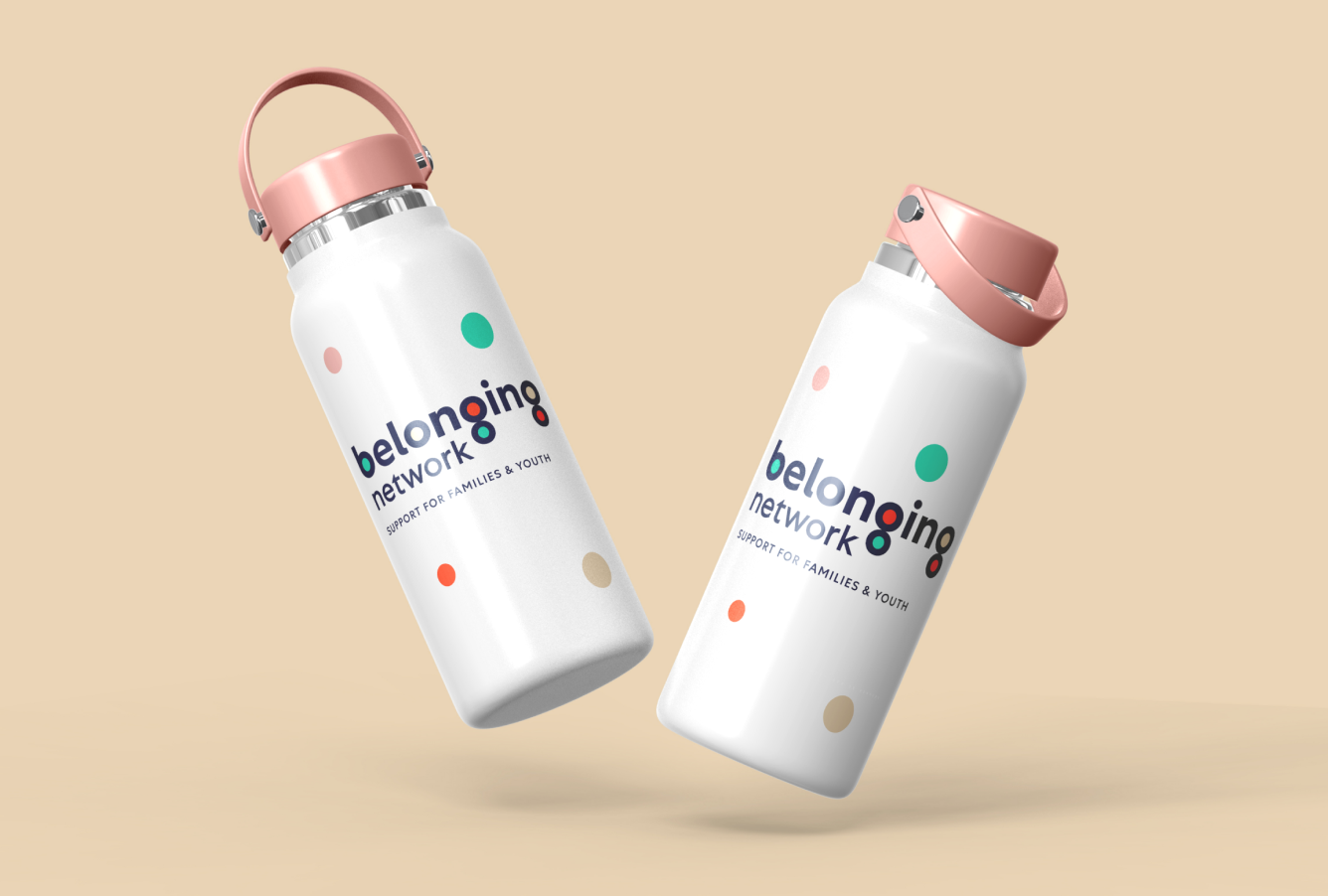
The carefully crafted warm and vibrant colour palette speaks to the brand character and values of the Belonging Network. Leading with a navy to represent trust, respect and commitment, we also introduced more vibrant colours that bring forward the open, cheerful, and passionate energy of their community. Overall, the design uses a palette that communicates inclusion, confidence and the importance of diversity.
As we embarked on the early stages of website design and development, we completed a
brand style guide with clear visual and verbal language, including direction on how to express the Belonging Network’s brand through colour, visual elements, copy, imagery and typography. The brand style guide serves as a concise introduction to the Belonging Network’s brand foundation, and is a vital resource for content creators to bring the new brand to life online and offline.
We are delighted to have supported this monumental brand transformation and look forward to following the evolution of permanency and family support in British Columbia and beyond.