Gilda’s Toronto: Providing Exceptional Cancer Support
- Health
Gilda’s Toronto is a registered charity that provides comprehensive, evidence-based programs and services free of charge to support and provide hope to people who have been impacted by cancer. From support groups to enhanced virtual offerings, they focus on community-building and guide members toward tailored programs that care for their bodies and minds. Their purpose: to help people live while living with cancer.
The Challenge
Defining audiences to streamline navigation
Gilda’s Toronto needed a website that would serve their users at the same high standard as their personalized and therapeutic cancer support services. For people visiting a website during what is often a difficult time, it was vital to build a platform that embraced a user-centric approach. We worked with Gilda’s Toronto to identify the multi-faceted needs of their audiences so that we could create a new website that would deliver an intuitive user experience.
We started by conducting interviews to identify and define the organization’s audiences and build a strategy that would inform all UX, design and technical decisions as the project progressed. To meet the needs of their website visitors, program members, donors, potential volunteers and employees and, ultimately, the community at large, we prioritized the importance of clear website navigation, a smooth content management experience and a well-organized path for donations.
Client
- Gilda’s Toronto
Sector
- Health
Service
- Strategy
- User Experience
- Design
- Development
Technology
- WordPress


The Solution
Embracing a welcoming, user-centric approach
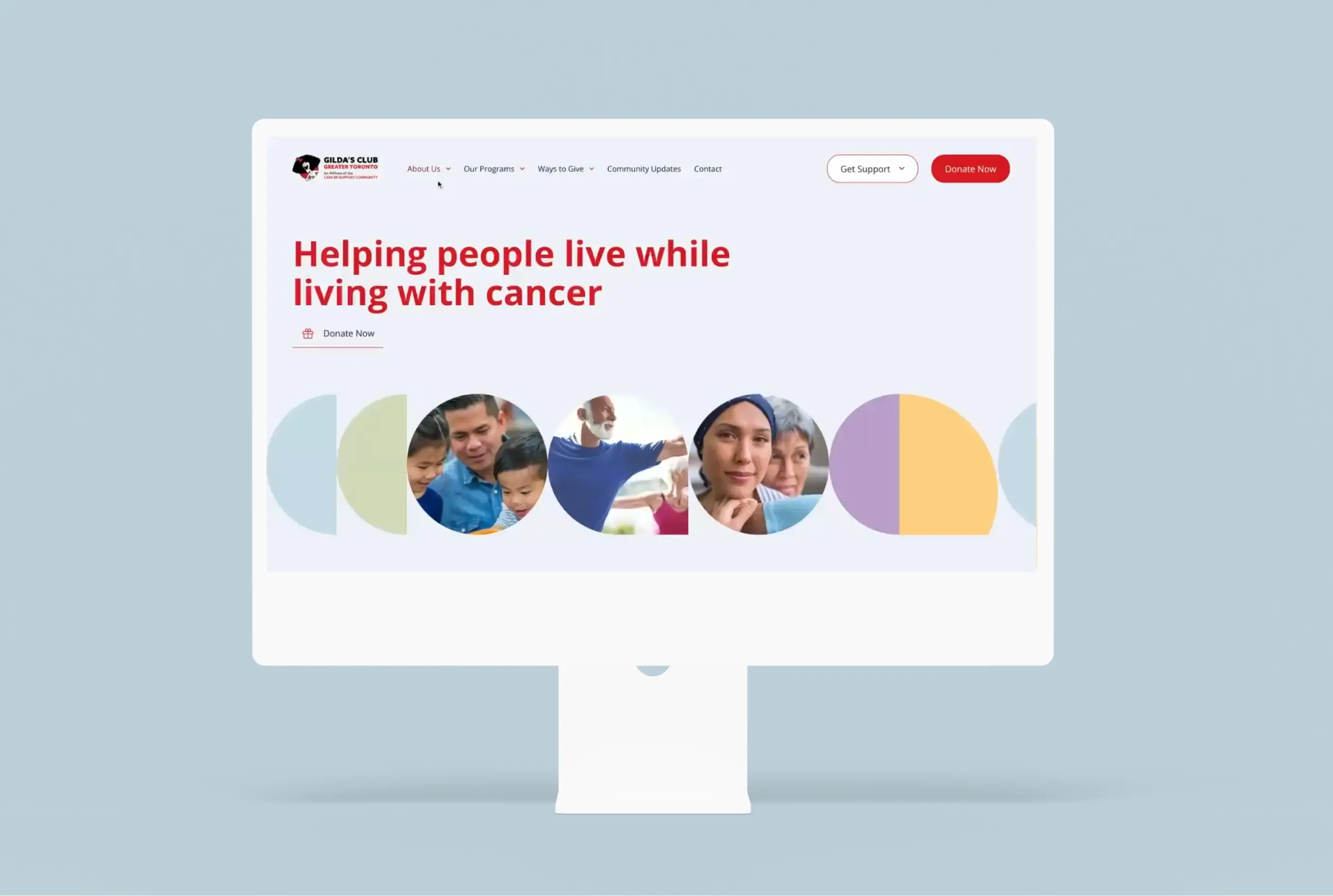
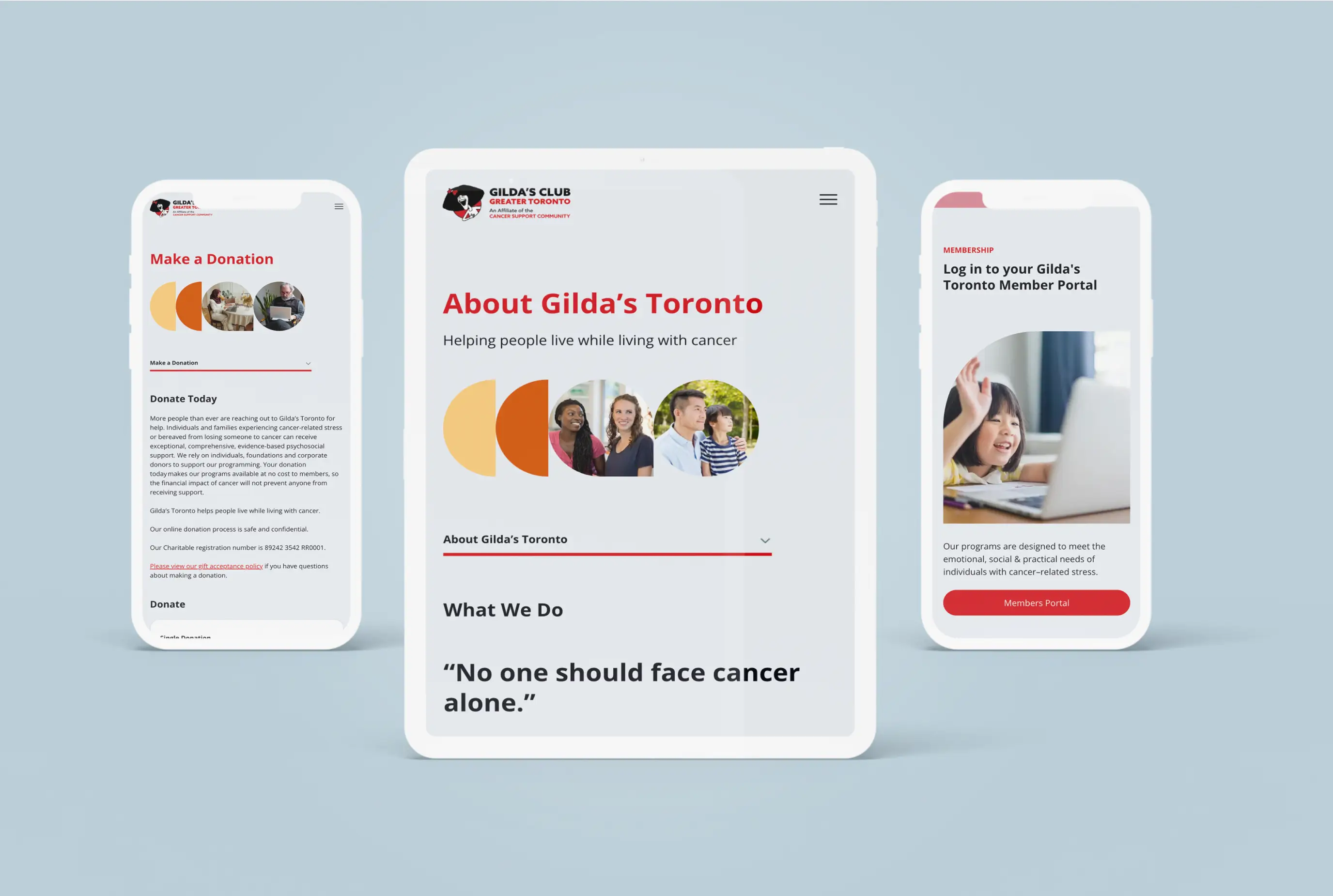
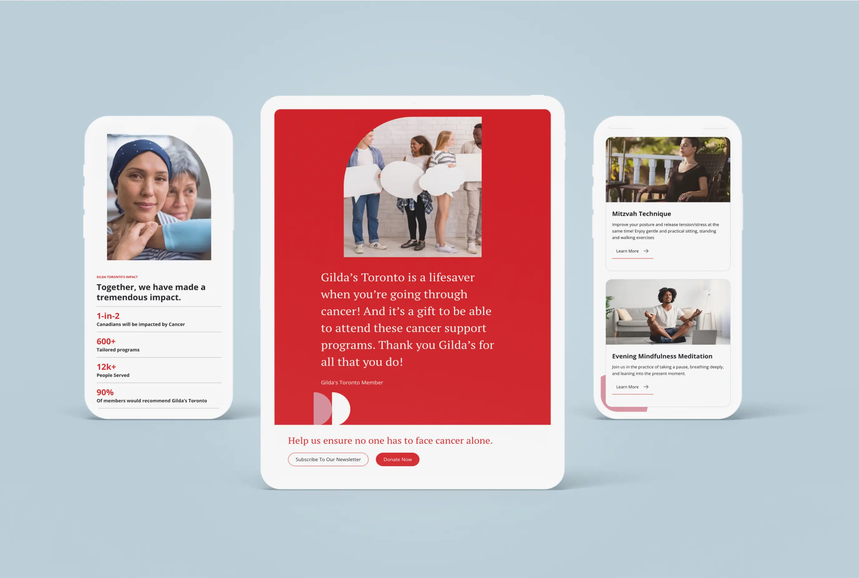
We created a mobile-friendly design that honours the whimsy of the Gilda’s Toronto brand, while also providing a comforting and supportive experience for people visiting the website. To ensure that diverse audience needs were met, we also brought the site in line with best practices in accessibility, user experience and universal design.
Giving thoughtful consideration to the internal team and their content management experience, we made design and technical decisions that simplified the site's ongoing maintenance. We configured native WordPress content management options to establish a smooth editing workflow, and also established a design framework that intentionally incorporates elements that are easy to update. The new website celebrates the community of cancer care including those who are looking for support and the people who help to provide it.


