BC Civil Liberties Association: Defending Human Rights
- Social Justice

The BC Civil Liberties Association (BCCLA) is committed to promoting, defending, sustaining and extending the civil liberties and human rights of people in British Columbia and across Canada. As an advocacy organization, the BCCLA pays particular attention to the needs of vulnerable individuals and oppressed communities to advance equity. Their work centres around litigation, law and policy reform, and public legal education.
the challenge
Time to restructure content and modernize the design
Through our initial conversations with the BCCLA, we identified numerous challenges that would inform the redesign of their website. The website’s information architecture was a primary concern: the content was difficult to navigate, and the site functioned more as an archive than an engaging source of knowledge and support.
From a user experience standpoint, the site needed to be mobile-friendly and accessible with digestible content and a compelling visual design. BCCLA had a well-established brand so it was important for us to refine and modernize their look and feel without departing significantly from their colour palette.
Client
- BCCLA
Sector
- Social Justice
Service
- Strategy
- User Experience
- Design
- Development
Technology
- WordPress
the solution
User research informs an enhanced and accessible experience
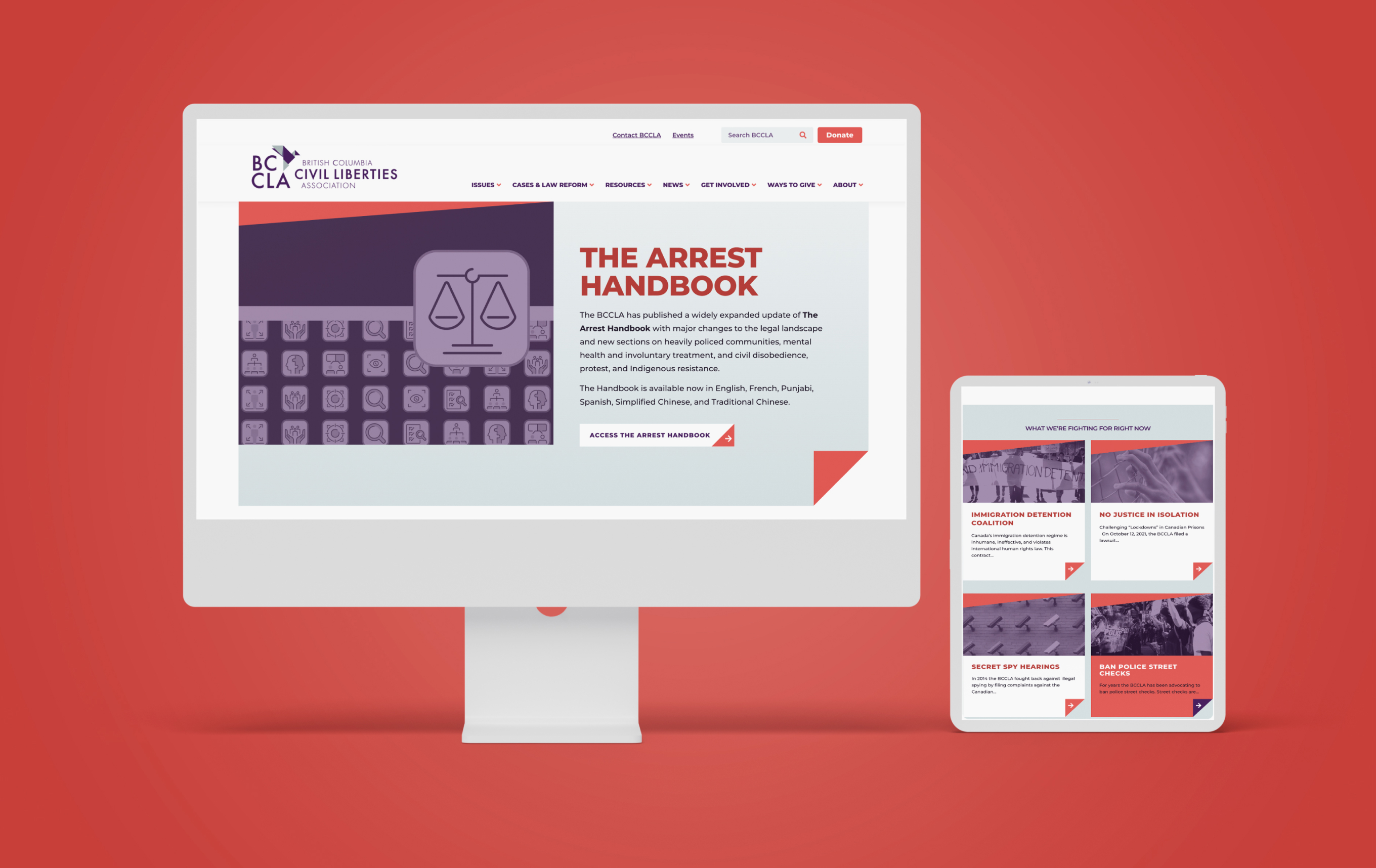
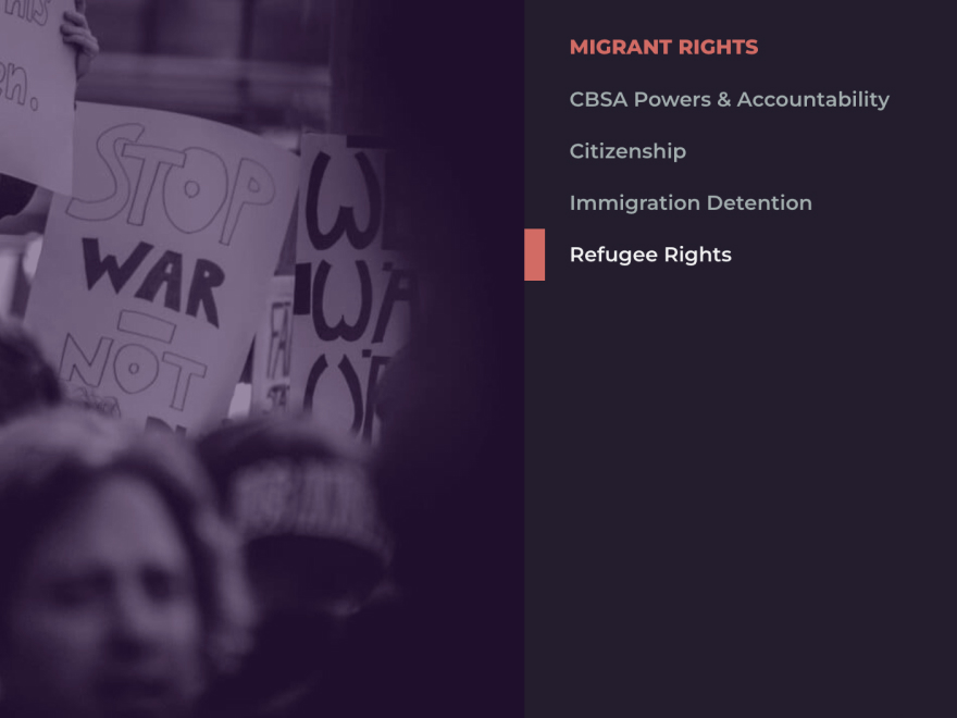
Focusing on the user experience, we conducted research that confirmed our concerns that the main menu navigation was being ignored and users were choosing the search tool instead. We reorganized the site’s architecture in a way that was logical and intuitive and enhanced the search functionality for visitors to efficiently find specific information.
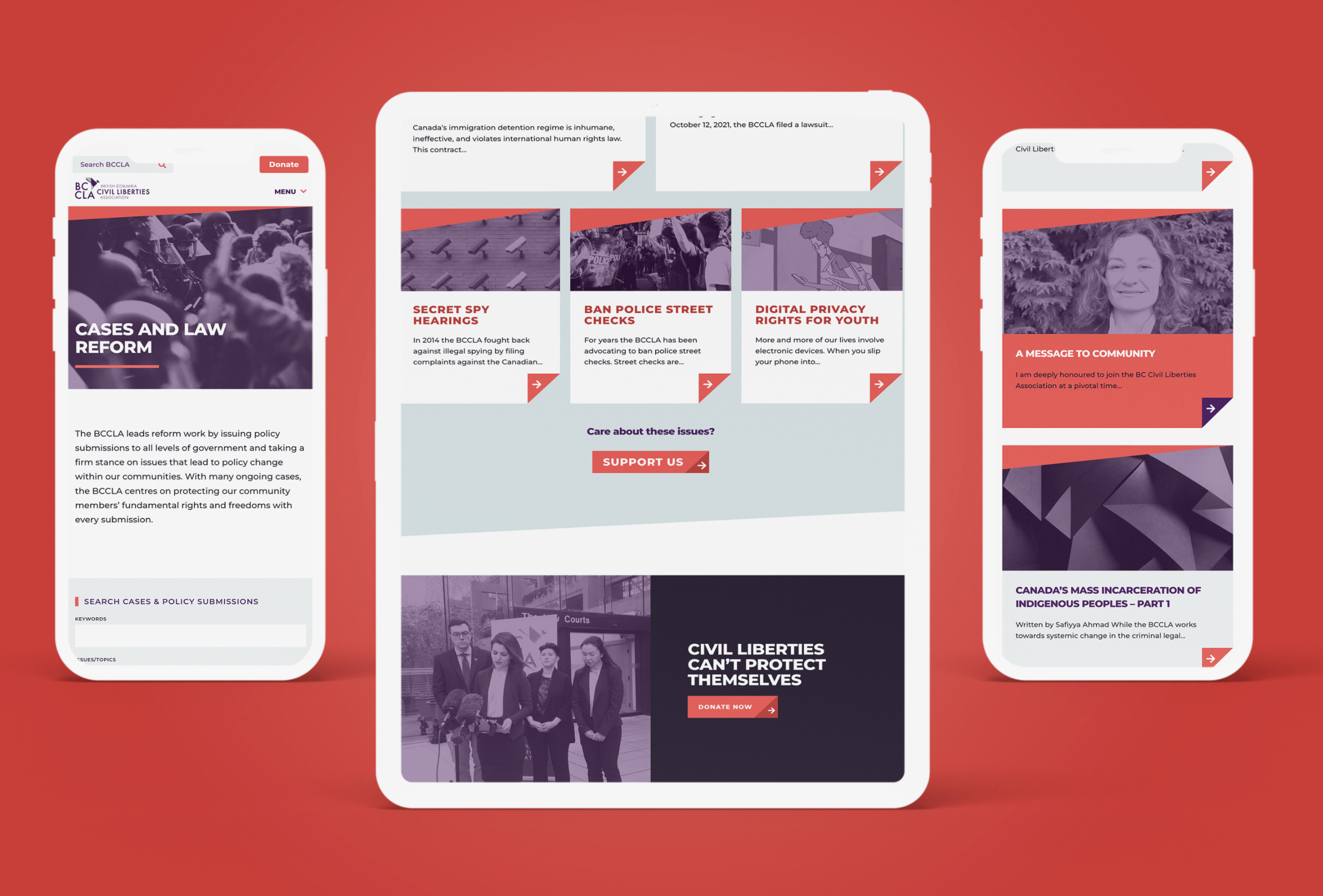
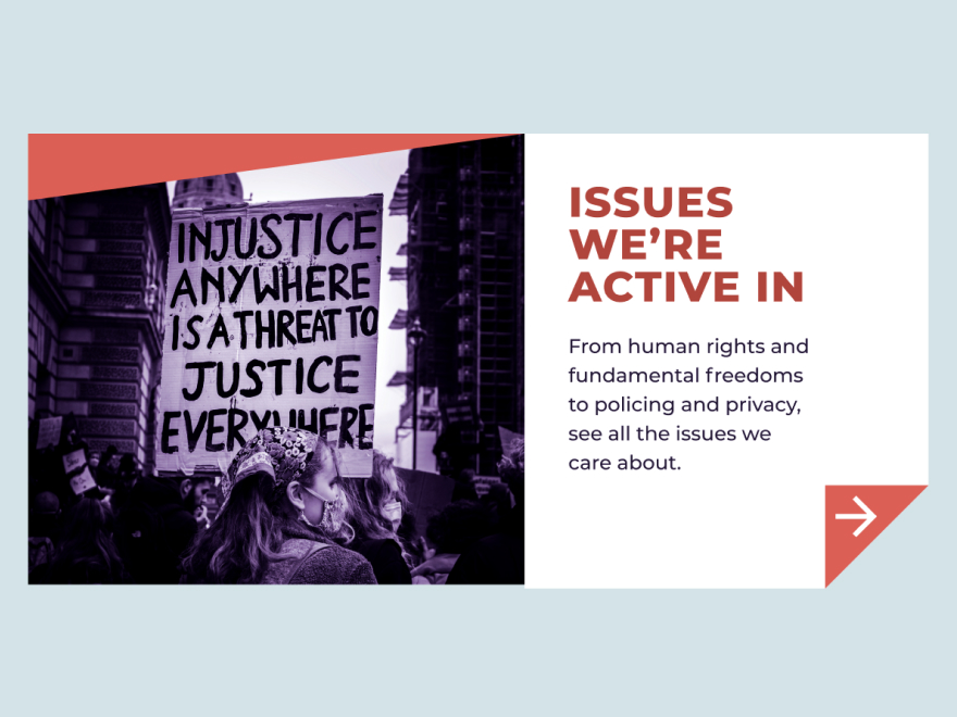
The redesigned site used a clean, modern approach that embraced the use of graphics, colour treatments and white space to better differentiate between sections. To create a cohesive design that worked seamlessly across devices, we developed a responsive treatment that stacked content vertically, making it easier to navigate.
Overall, the organized layout with clear calls-to-action and visual cues that draw attention to highlighted topics and campaigns created a more scannable website. In keeping with universal design, WCAG standards and principles were incorporated at a foundational level to ensure that the site is beautiful and accessible.