Invasive Species Council of BC: Protecting Our Ecosystem
- Environment
The Invasive Species Council of BC (ISCBC) is a registered charity and non-profit society that helps communities work together to stop the spread of invasive species in British Columbia. Invasive species are a serious global issue, presenting the second greatest threat to biodiversity after habitat loss. With the effects of climate change, invasive species are having increasingly adverse effects on BC’s landscapes, and they continue to threaten Indigenous ways of life. ISCBC focuses on education and action to protect and build healthy habitats and communities across BC.
the challenge
Leading with research and listening to users
Our work with ISCBC began with a research and discovery engagement to surface the key aspects of the user journey that were causing frustration for visitors on their website. In addition, the site did not meet current standards in digital accessibility, creating friction for their audiences, including enthusiasts, educators, regional partners, and the general public. Through heatmap analysis, surveys, and analytics review, it was clear that the site’s navigation and wayfinding did not adequately support the website’s visitors: 40% of respondents reported difficulty finding what they were looking for, and popular pages had high bounce rates. Users were dependent on the search tool, but it was causing further frustration due to its limited functionality.
After reviewing our findings and aligning them with the website goals, we developed a series of recommendations to significantly improve the online experience.
Client
- Invasive Species Council of BC
Sector
- Environment
Service
- Strategy
- User Experience
- Design
- Development
Technology
- WordPress
the solution
Digital accessibility is essential for good UX design.
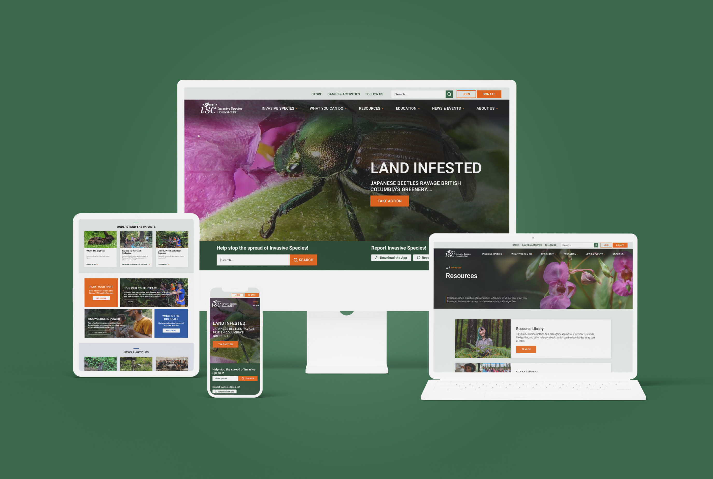
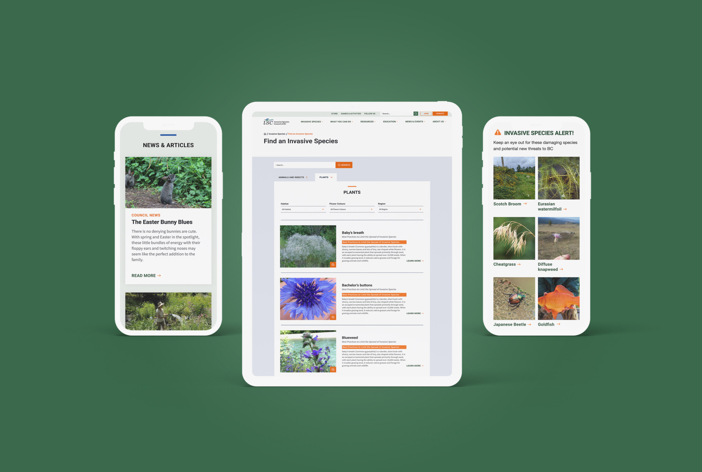
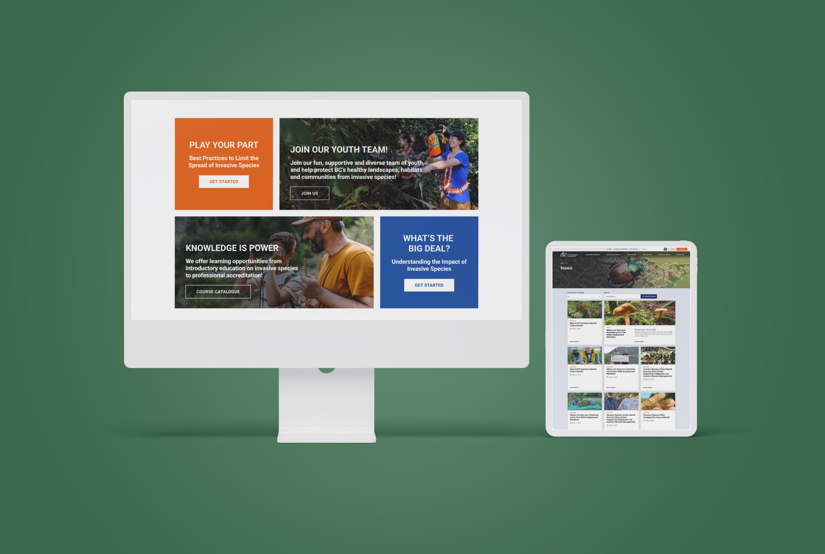
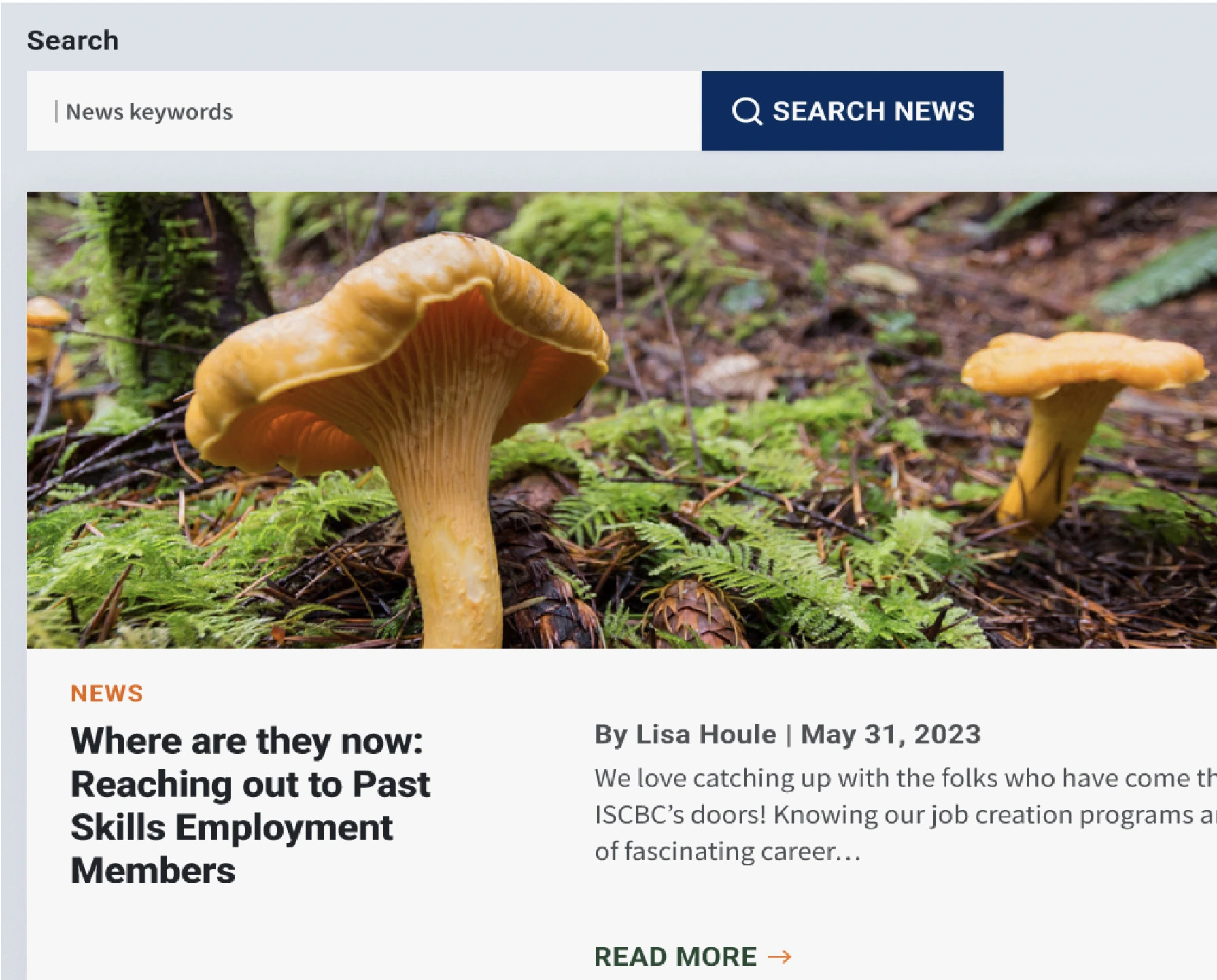
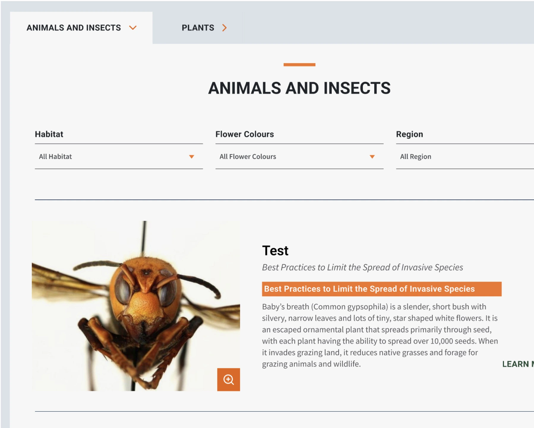
Insights from research laid the foundation for a user experience upgrade that embraced a universal design approach. We collaborated with ISCBC on a content strategy and hierarchy to better serve the audience and the organization’s engagement goals. We made significant updates to the site's information architecture to enhance navigation and supported these UX decisions with design elements that honoured the brand and invited user engagement.
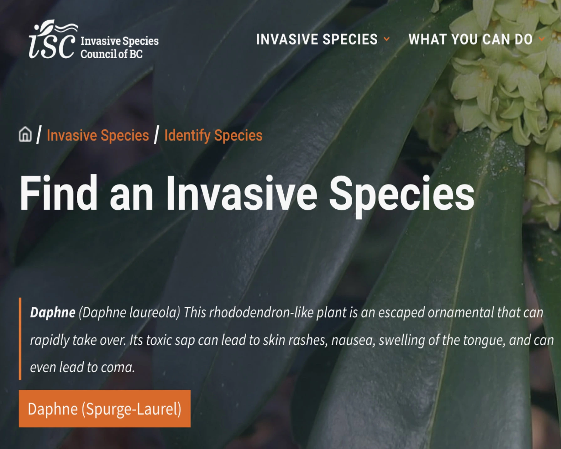
Best practices in digital accessibility were introduced on the site to make the content more scannable and less cognitively demanding. The colour contrast was increased to meet WCAG AA standards, the language was simplified, and navigation became legible. The site was built in WordPress with Elementor so the internal team and site administrators could easily maintain the platform and its evolving content. In the end, taking a universal design approach benefited all users and created an intuitive, compelling experience for a variety of audiences.


