SFU Public Knowledge Project: Power to the People
Born out of a commitment to the democratization of knowledge, the Public Knowledge Project (PKP) strives to increase public access to information through research and scholarship. Given the rise of misinformation online, their work is increasingly vital to the healthy evolution of our global communities. Using open source software, PKP is advancing open access to the publishing of journals and books.
Client
- SFU Public Knowledge Project
Sector
- Education
Service
- Strategy
- User Experience
- Design
- Development
Technology
- WordPress
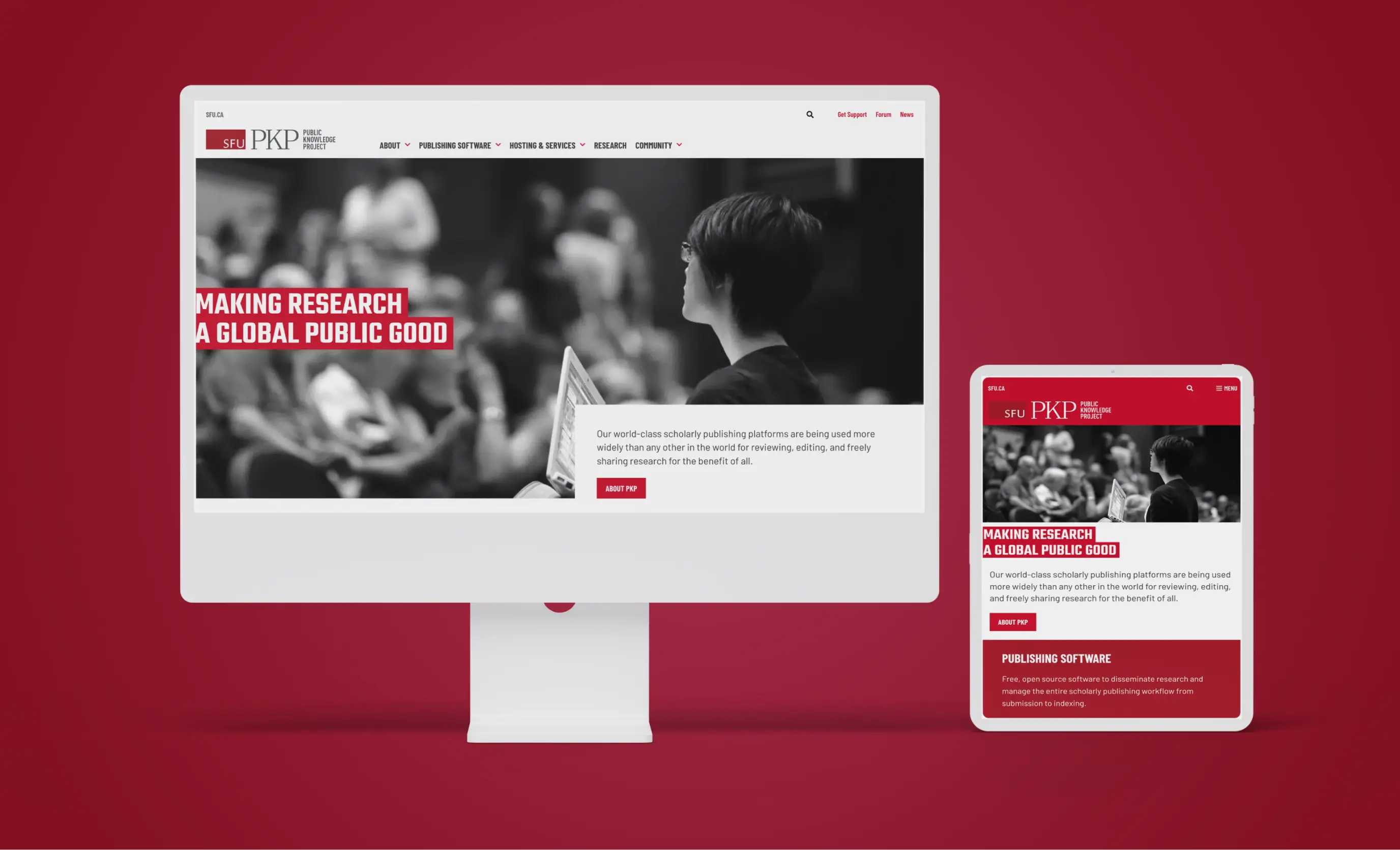
the challenge
When too much is too much
When the Public Knowledge Project (PKP) team contacted Affinity Bridge, they had recently become part of the Simon Fraser University (SFU) umbrella so needed a new co-branded website. The previous PKP website was outdated and confusing to users. Too much information had accumulated on the site over time, and content was not well organized, so it was easy for site visitors to get frustrated and abandon the website.
In addition, users struggled with the website being overly technical. It was difficult for users to understand PKP’s service offerings on a broad level, and software pages were particularly overwhelming. For a program so wholeheartedly committed to community, sustainability and open access to knowledge, PKP was missing a huge opportunity to connect with their target audiences.
the solution
Simplicity is best
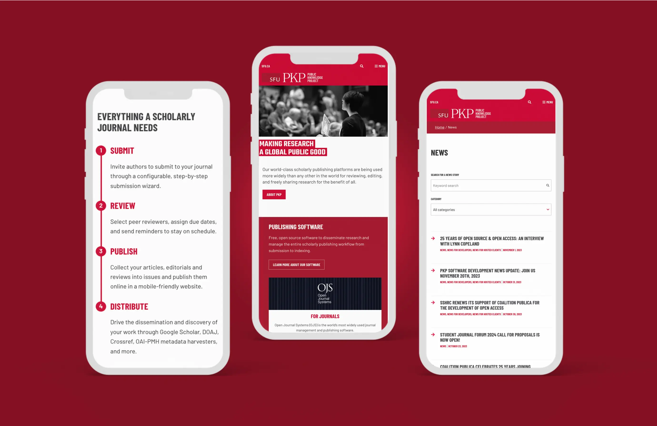
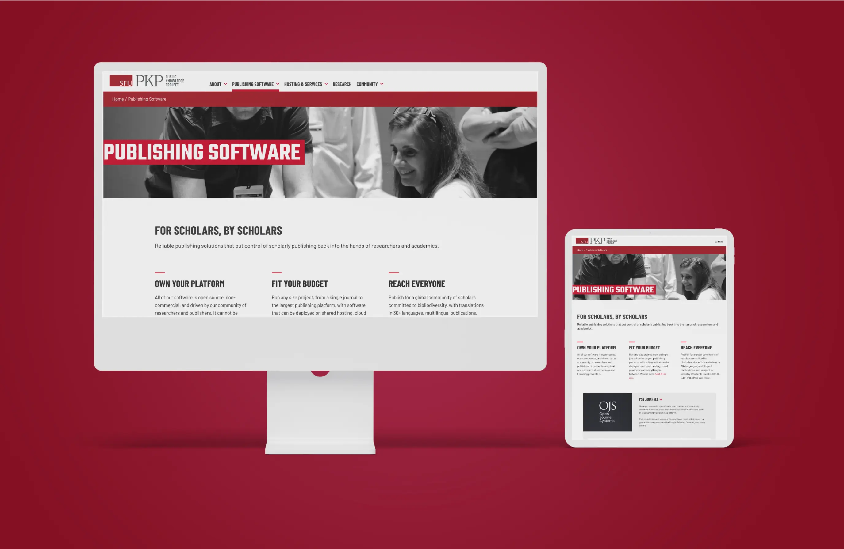
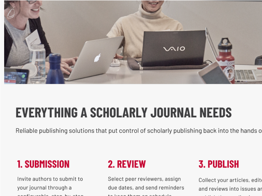
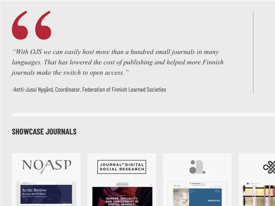
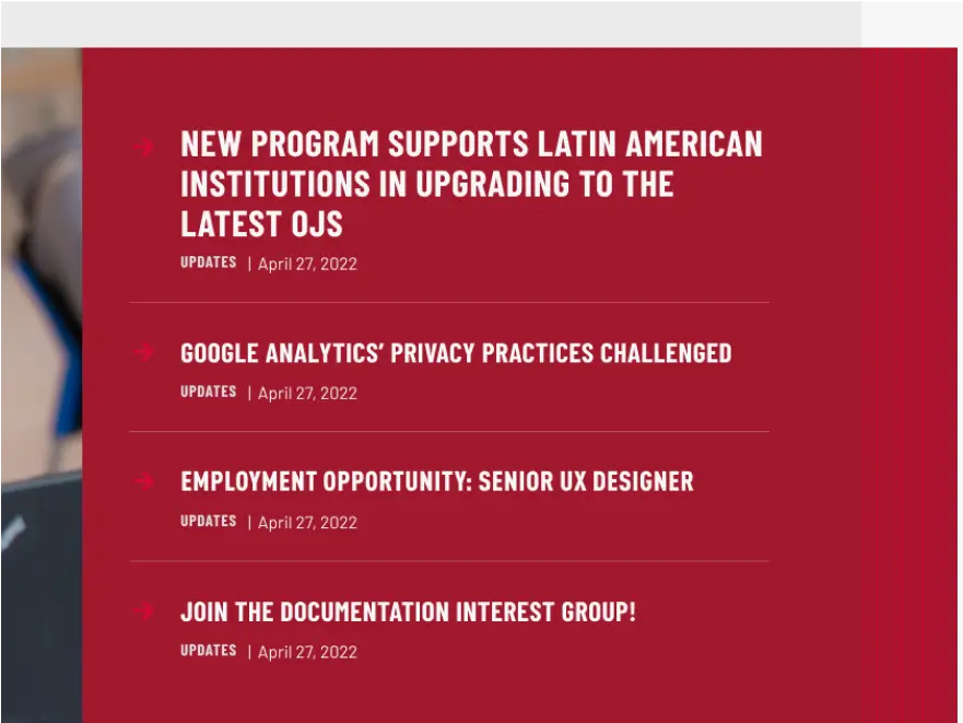
Affinity Bridge worked closely with the PKP team to completely overhaul the content organization to make the new WordPress website that is much more accessible to a wider audience of non-technical users. We used a layered approach, with landing pages and simplified language to provide a high level overview, allowing users to dig deeper into the more technical aspects as desired.
The new design incorporates bold branding inspired by SFU, combined with design elements unique to PKP, establishing PKP as a sub-brand of SFU, while maintaining its distinction. Strong typography, use of red and white space, and large graphics bring excitement to the content and contribute to a welcoming website and engaging user experience overall. The new website meets PKP’s key objective of clearly communicating their mission and core offerings, and delivers a cohesive visual design across the main website and key communication tools including an e-newsletter template.


