Creative Commons: Sharing Knowledge Equitably
Creative Commons is a non-profit organization that has stood for open access to knowledge and creativity for decades. The platform allows people to share their copyrighted works via free legal tools. Their work has evolved over the years, as sharing open-license content has become a global movement. Current areas of impact include arts and culture, open education and science, policy and advocacy, open data, and technology.
the challenge
Large-scale WordPress redesign
When Creative Commons approached us, we were excited as we shared their passion for open-source technology. They had big goals and needed help creating a website that would support their mission and the greater community in advancing knowledge-sharing in an equitable and ethical manner.
Their current website was not successfully representing the vibrancy and grassroots nature of their organization and work. Top call- to-action were not clearly identified, resulting in a poorly organized site and frustrating user experience.
Client
- Creative Commons
Sector
- Arts & Culture
Service
- Strategy
- User Experience
- Design
- Development
Technology
- WordPress
the solution
Multi-stakeholder discovery
We started with a discovery process that required us to collaborate with a distributed team across an extensive digital ecosystem so that we could learn as much about the system as possible. The outcome of this phase was the creation of a shared vision for the updated site.
We documented and prioritized Creative Commons’ systems and processes while maintaining focus on the objectives for the new site. This holistic approach allowed us to set a roadmap for future development, while also prioritizing key deliverables for the initial implementation.
"You were adept at taking in a ton of information and opinions and distilling them all into a series of clear and manageable steps/decisions and then ultimately into one cohesive vision/product."
Making it easier to understand Creative Commons
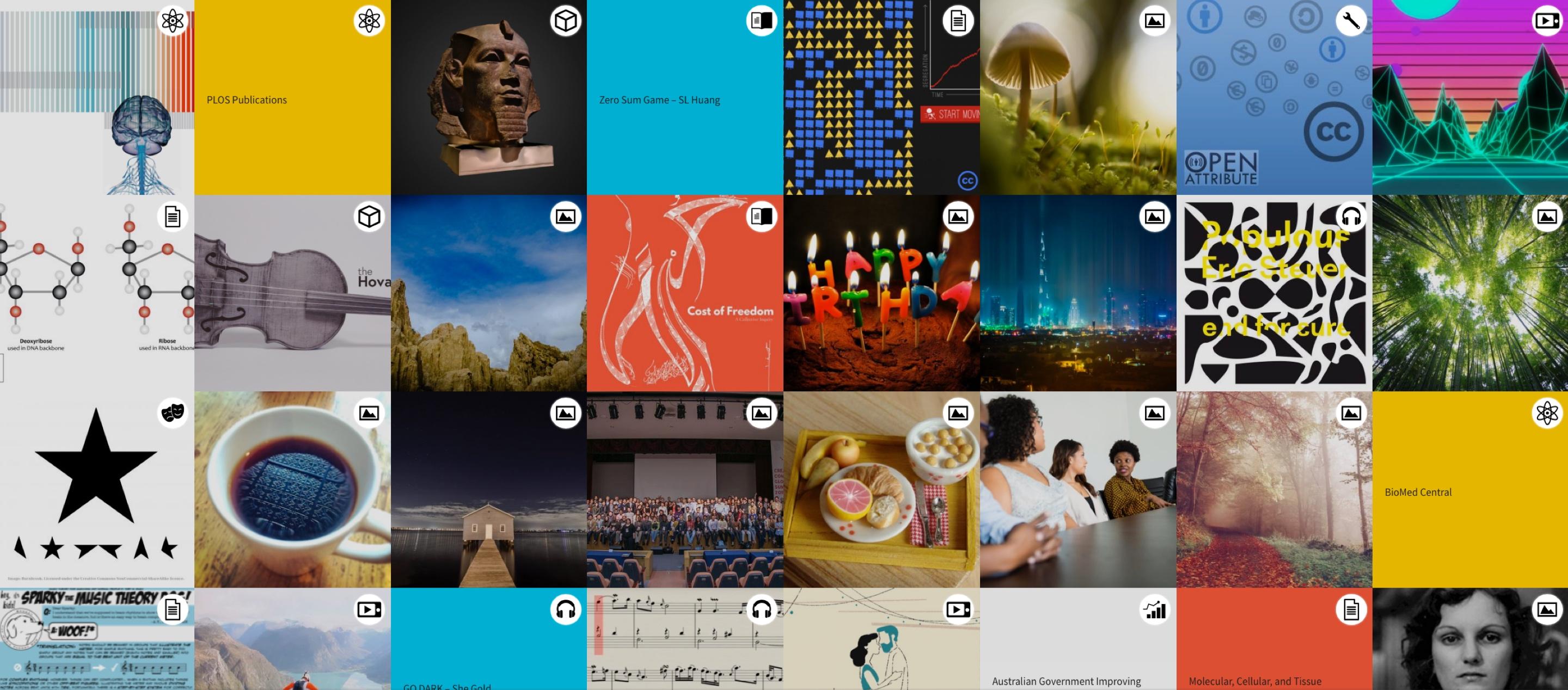
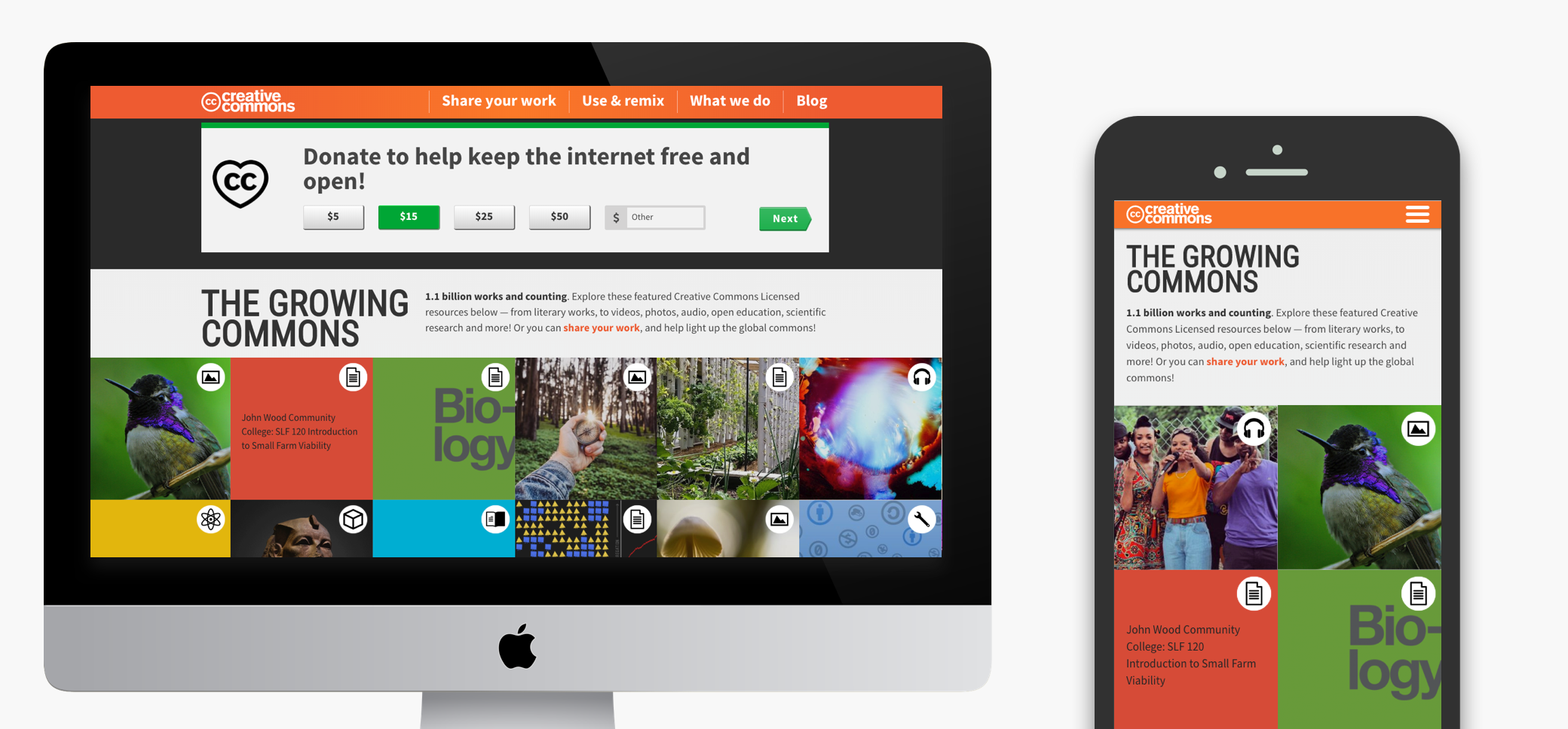
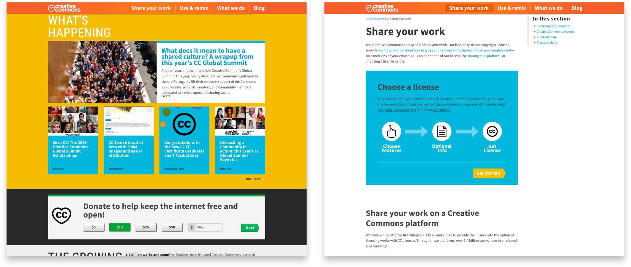
One of the goals for the new website was to simplify the content and organizational structure, creating easy pathways for all audiences — both novices and experts — to find what they need. We started with an exhaustive content audit and analytics review to help inform a simplified information architecture. We restructured the content and navigation to make it easier to understand the vision and mission of Creative Commons, as well as what it provides: licenses, search, and access to creative work.
We complemented the structure with a clean and uncluttered look-and-feel with crisp lines and clearly delineated sections, minimal text and ample use of white space.
"I cannot tell you how excited we are for today's launch and the amazing work you all have done!!! We appreciate the care and expertise your team has brought to this project. The website is beautiful and engaging and donating feels easy! We've come so far in such a short time and we can't wait to get started on the next phase."
Significant increase in site traffic and donations
As a non-profit, it’s critical that the donation experience is as simple as possible for users. We focused on streamlining the giving pathway by bringing the donation forms directly onto the site, with a clear button in the header and links to the form in the footer.
Throughout the site, calls for donations were placed in strategic positions and effectively designed using large buttons, pre-selected amounts and a clear value proposition. All of these enhancements contributed to an 18% increase in donations in the first year after the launch of the site.