Women's Legal Education & Action Fund: Advancing Gender Equality
The Women’s Legal Education & Action Fund (LEAF) is a national charity that focuses on advancing gender equality for women across Canada through law reform, case intervention, and public education. LEAF cases have resulted in landmark victories preventing violence against women and gender diverse people, eliminating discrimination in the workplace, allowing access to reproductive freedoms, and providing better maternity benefits, better spousal support, and the right to pay equity. Charter rights have been tested and strengthened through the advocacy work of LEAF.
The Challenge
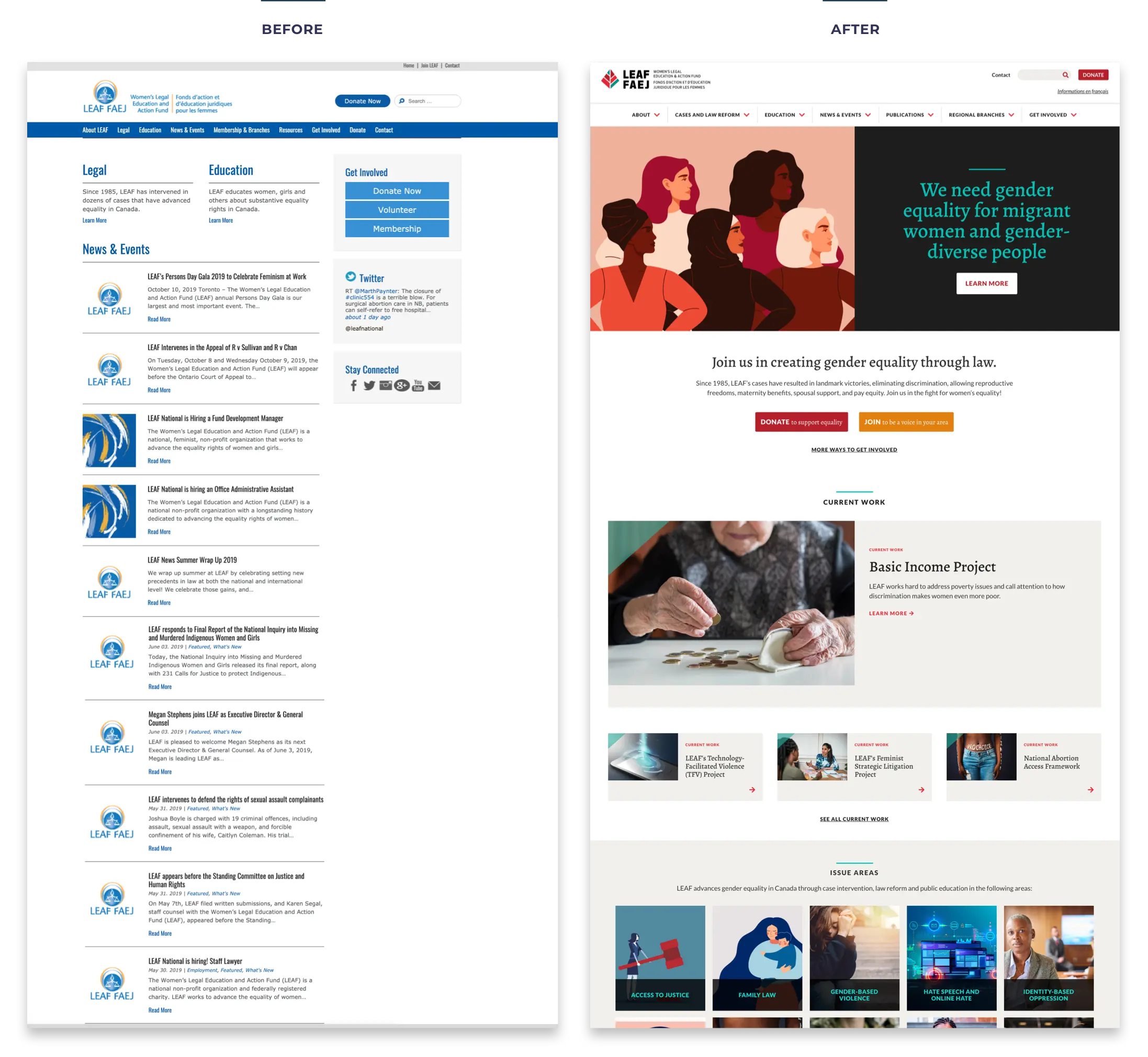
Outdated design and complex content
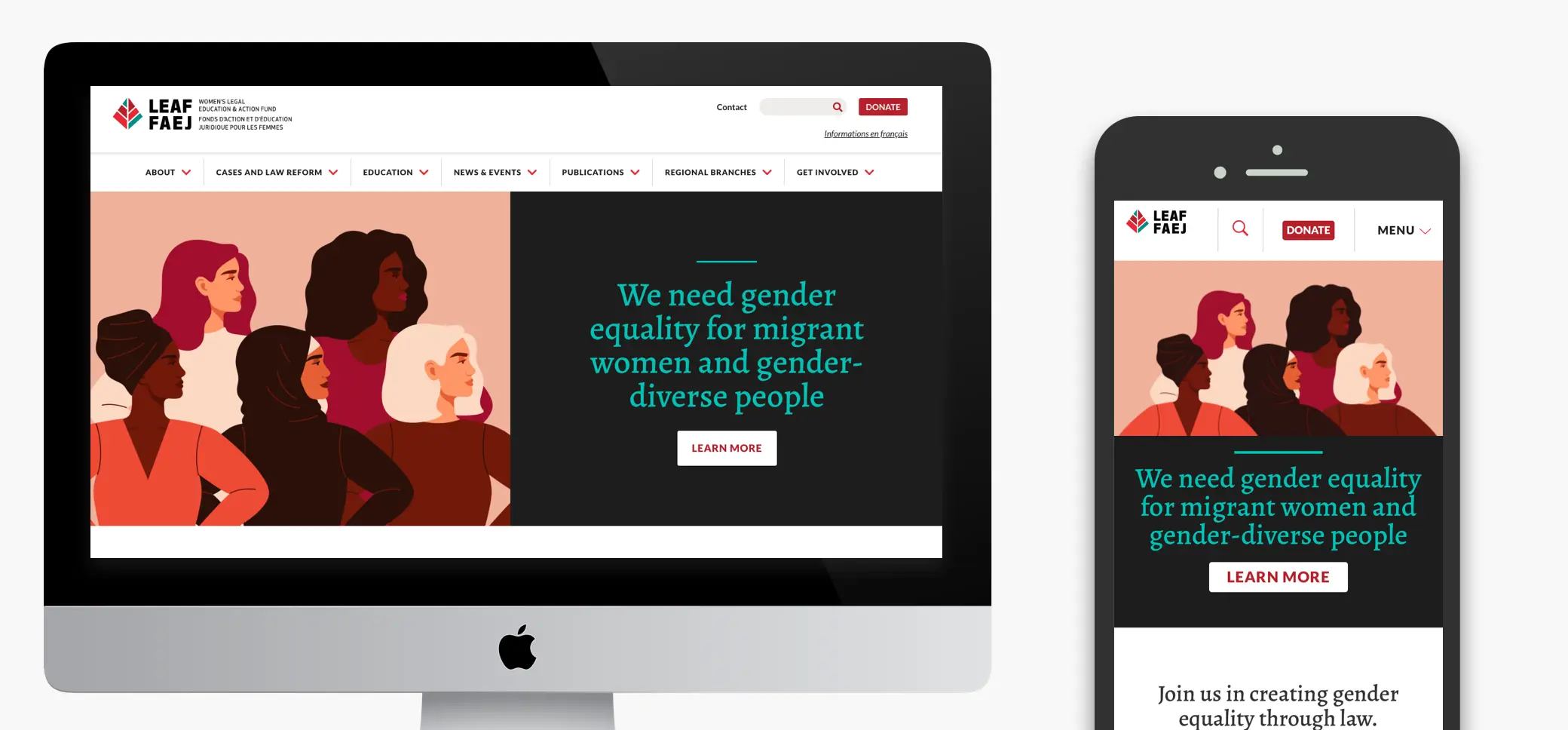
LEAF approached Affinity Bridge with the need for a revitalized brand and online presence. Their brand at the time was dated and flat. It lacked the energy of the organization, the people they served and the scale of their advocacy work.
Beyond the brand, the website needed an overhaul as well to address the significant challenges associated with their volume of content. As one would expect of a national legal organization, their content was dense and complex. There was no way to avoid the massive amount of information that needed to be available to users but rather, the challenge was to present it in a way that was easy to navigate and digest.
Client
- The Women’s Legal Education & Action Fund (LEAF)
Sector
- Social Justice
Service
- Strategy
- Branding
- User Experience
- Design
- Development
Technology
- WordPress
Our solution
Aligning LEAF's identity with their progressive work
The first phase of the project was to guide the organization through an identity redesign process in order to support their top-level strategic and online goals. We did a deep dive discovery process to get to the heart of LEAF as an organization, and create a new brand that more accurately captured their personality and progressive work.
The new logo and final design achieved this by establishing an intentional, accurate and consistent representation of their organization through a professional, approachable and modern design.
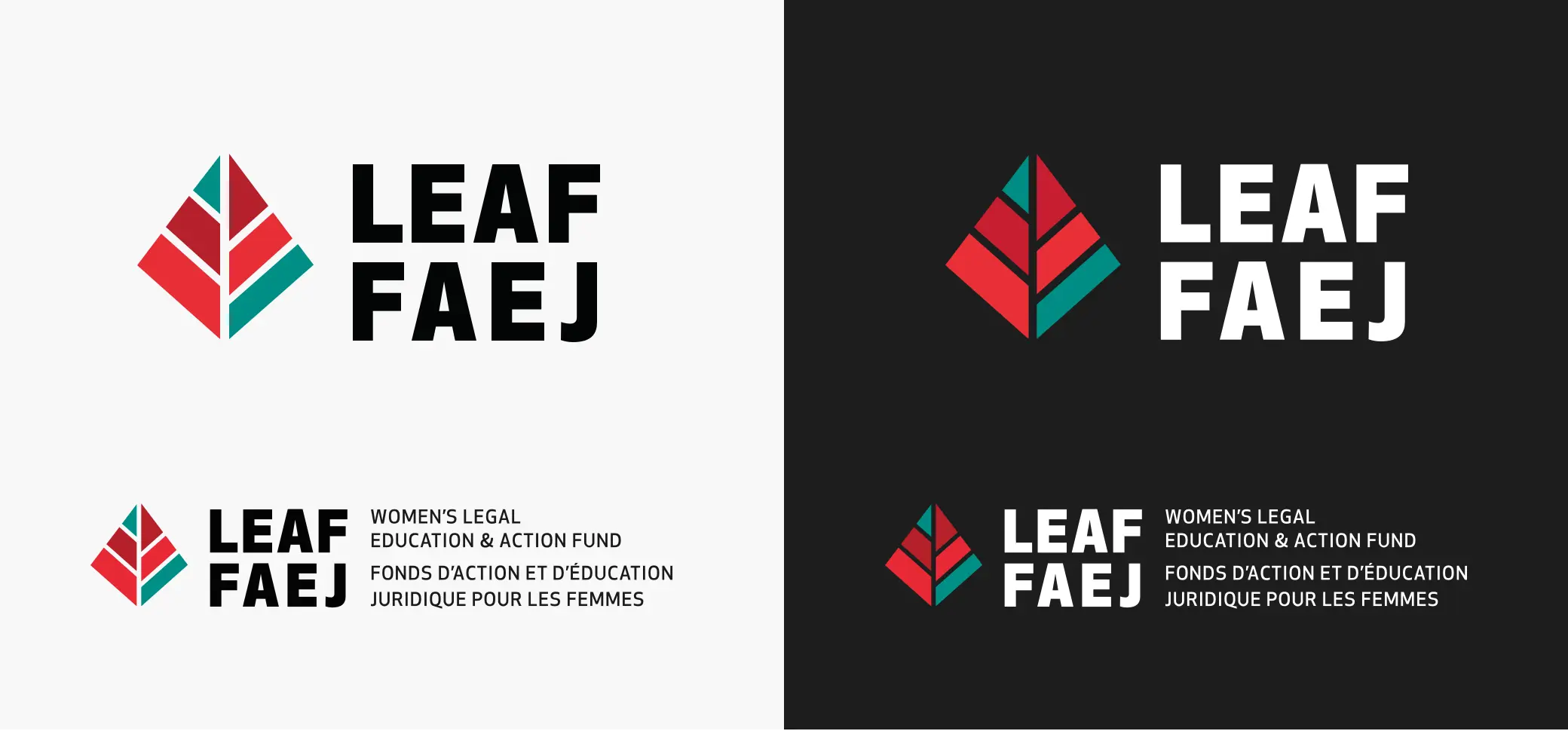
Turning over a new LEAF
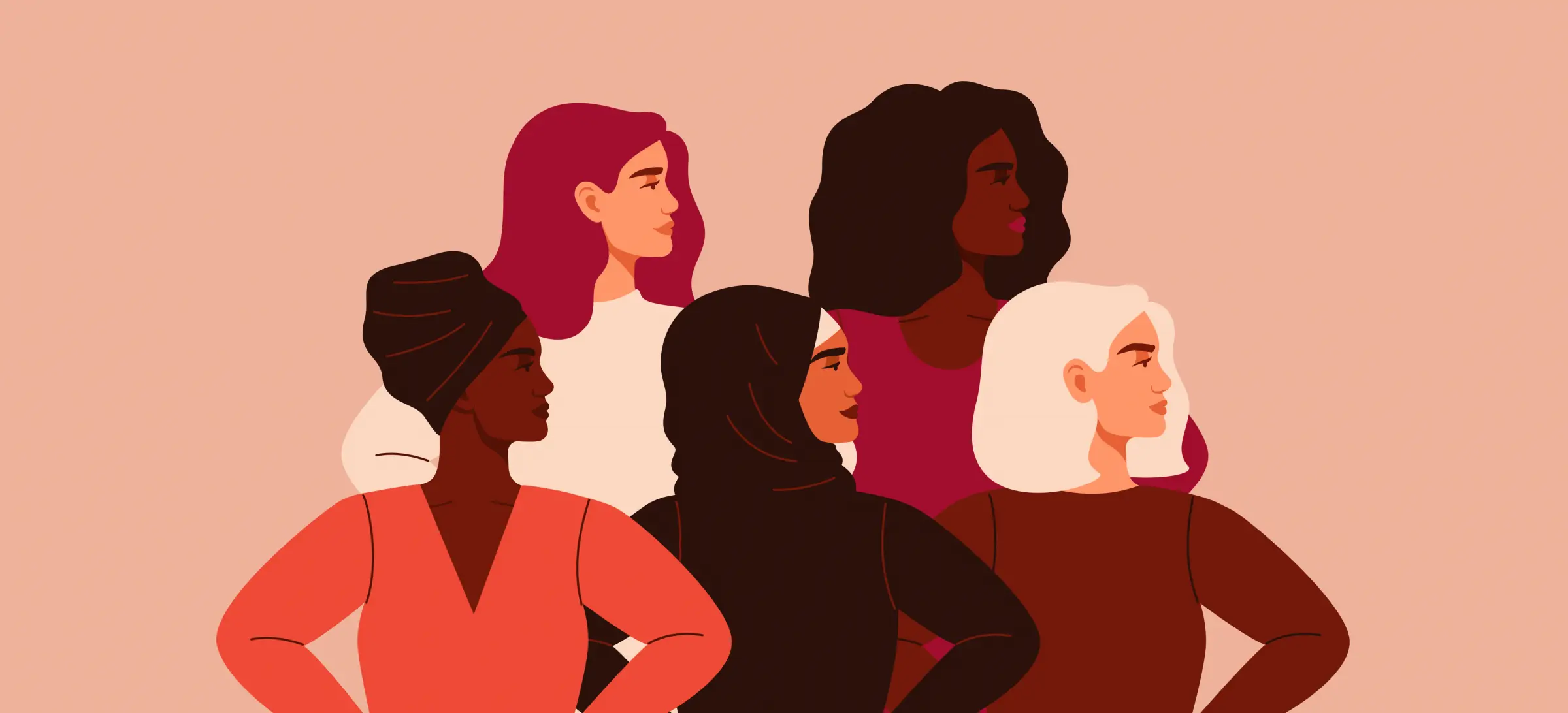
To create the new brand, we explored the concept of the living tree doctrine of the charter. The logo mark is a tree, with the trunk and branches shown in the negative space. The different coloured segments convey the diversity of women’s experiences and intersecting oppressions that LEAF is working to rectify. The shape is symmetrical on the outside, but the inside components are different sizes, symbolizing the imbalance of the law being brought into balance by LEAF.
Evidence-based design decisions for a better user experience
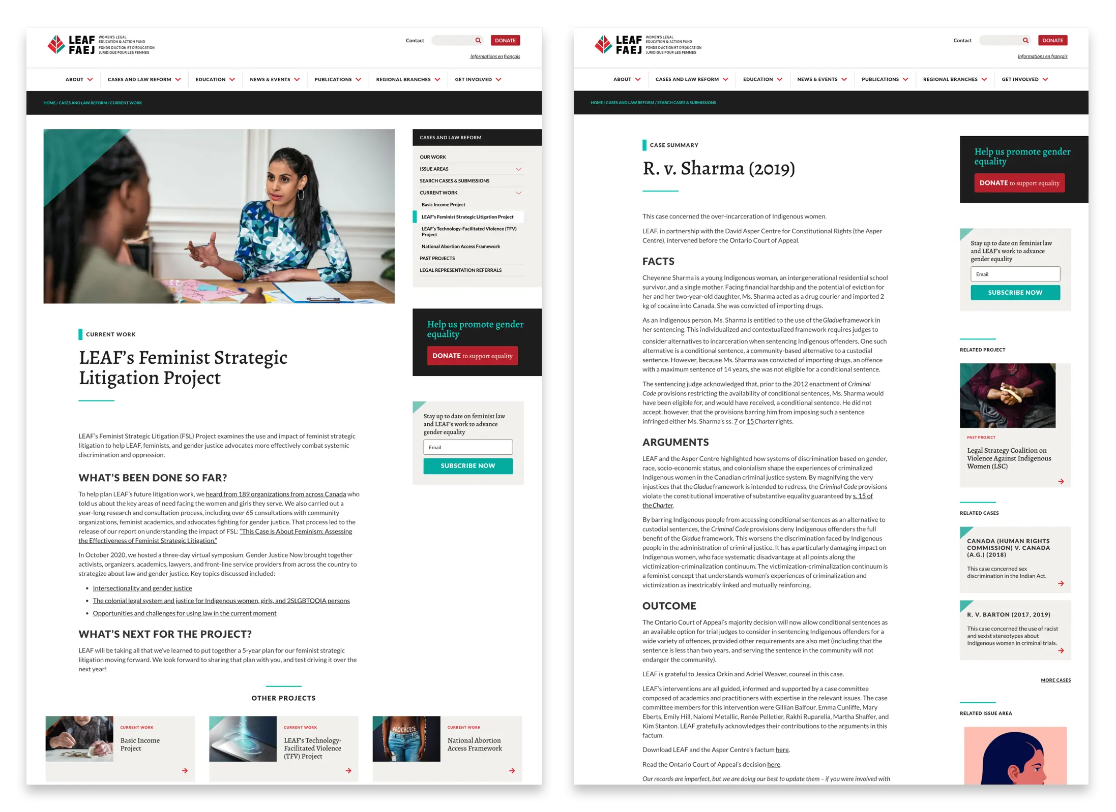
The next phase was the development of the website and content management system, which focused heavily on information creation and organization. We approached the project with data-driven decision-making and worked with LEAF through multiple project phases. Maintaining the integrity of the content while making it approachable for legal and non-legal audiences required deep collaboration between both of our teams.
We started with a user survey which uncovered two key themes: users were unsure if they were seeing everything connected to a case, and they found the site difficult to navigate. We also analyzed user data, and discovered that most users were entering the site via Google searches directly to post pages, and then jumping off from those pages without exploring the site further.